#07: An attempt at mapping the cloud
Mapping is a way to place and order certain things in a way that it becomes readable, often it serves a scientific purpose. But we tend to forget that a map is always a one-sided point of view, it is the perspective of the creator, a story told by someone else.
In the story I am going to tell I will be showing ways to interpret how we are being placed into the Global Positioning System (GPS). Since we almost always carry a device with a GPS tracker installed we are constantly being seen by various satellites of various countries. We are (n)ever lost.
Simultaneously I am investigating the interconnected grid of computers, routers, switches and cables better known as the ‘cloud’. This phenomenon is often seen as an energy saving, innovating way to store, share and access our files while in reality cloud computing is one of the most energy consuming infrastructures we know today. Should we reinvent the way we talk and think about this ICT system? Will there be enough supplies for our ever growing demand for fast data transfers? Do we need to search for a new way to fuel our digital demand? And do people really understand what exactly is the cost of our need for full HD?
In this essay I will give an impression of my research project so far, the references that helped me and the artworks that express the feeling I want to catch.
Mercator projection
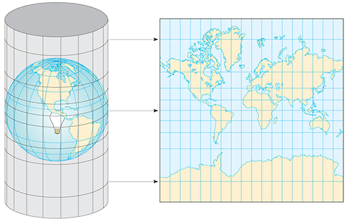
An example of the ‘one point-of-view’ topic that is often unavoidable in mapping is the Mercator projection, used by Google maps and almost any map depicting the world we saw in the classroom. When converting a sphere like the globe onto a flat surface like a map distortion is inevitable. To understand the Mercator projection you have to imagine that the spherical shape of the globe is projected on a cylindrical surface, the equator is already cylindrical but more distortion appears when we move closer to the poles. The result is a map where Greenland looks bigger than Africa, while in reality it only comprises 1/14th of Africa.
This map is invented during the time European colonialism reigned the world. In this projection Europe is shown bigger and less distorted than its colonized countries of that time. We are still used to this colonial way of depicting the world even though we know this projection shows a distorted colonial point of view which is outdated and results in alienation.
Whole World Overview
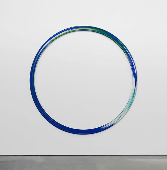
This work of Anne de Vries shows a satellite photograph of the Earth stretched in a circle where the north and south poles are connected to each other. Continents cannot be recognized and the north and south pole morph into one white frozen plain. Both the map of De Vries and the map of Mercator are just ways to portray the whole world; there is no correct way to do this, there is no up or down. It is a matter of perspective; Imagine it from the perspective of the satellite(s) that took the picture, what sense does ‘north’ make when you are orbiting 22.000 kilometers removed from the surface of Earth?
This feeling of losing a sense of direction and distance often appears both liberating and frightening to me, something that is expressed really well in the work of Anne de Vries.
Null Island
Located where the equator meets the prime meridian in the Gulf of Guinea 500 kilometers from the coast of Ghana, there is a fictitious place called ‘null island’ (0’00’00’’0 N, 0’00’00’’0E). Until we figured out that we can also map the world using computers, this square meter of water didn’t serve a purpose. Nowadays the null island is the reference point of digital mapping techniques. Humans need scale and measurements like a hand or foot to understand the ‘never-ending’ distance of the oceans, We move from ‘one’ point to ‘another’ point. computers also need this point to take off, but where should computers start?
This ‘starting place’ became Null Island. In computer science you cannot fill in nothing, computers need ‘something’ so that something became the word ‘null’.
The Null island is the place where GPS tagged pictures and data end up when there is an error, the place where they will end up when they are lost, so in a way the Null Island is the most crowded place we never even visited.
Toxic Lakes of inner Mongolia
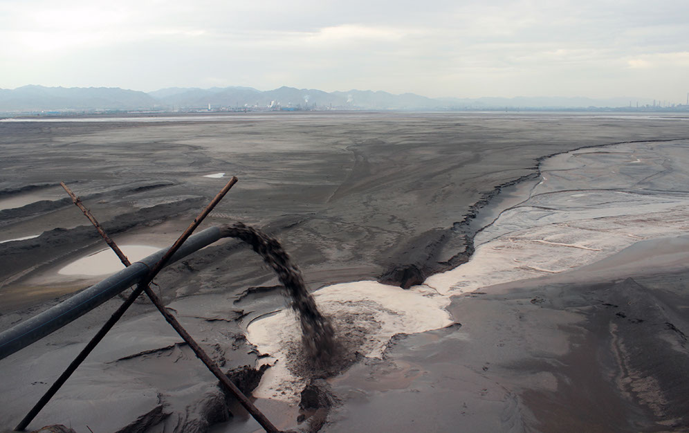
The Unknown Fields Division call themselves: ’A nomadic design research studio that ventures out on expeditions to the ends of the earth to bear witness to alternative worlds, alien landscapes, industrial ecologies and precarious wilderness’ In an expedition following the unmaking of an object they end up in rare Earth refineries located in Inner Mongolia.
Modern electronic products we use consist of these so called ‘rare Earth metals’ these metals can be found in the magnets of the headphones we use and are involved in the manufacturing process of the computer and smart phone screens we look at every day.
If you reverse the manufacturing process of electronics you end up at these refineries located in Mongolia and China. Only 30% of the worlds rare earth metals are located here but 90% of the rare earth metals that are being mined come from these industrial cities.
Extracting rare earth minerals is a hazardous and toxic process resulting in a lot of toxic waste from the by-product.
The consequence of decades of mining is best seen in the toxic lake of Baotou where they turned a dammed river into a dumping ground for toxic waste. Several pipelines dump toxic black sludge into this artificial lake day and night. The result is a dystopian landscape of toxic lakes and a contour of polluting smoke from the refineries. This is the machine to keep the cloud up and running. The dark side of the utopian interconnected world we are living in right now.
Ming Dynasty vases
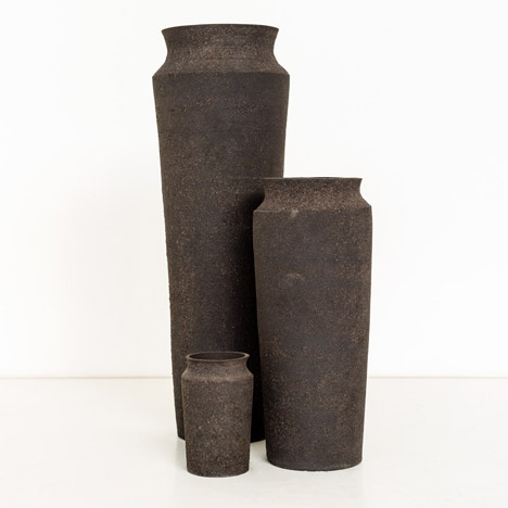
The Unknown Fields Division collected samples of this toxic mud and turned into ming dynasty vases, each vase resembles the exact amount of toxic by-product that is needed for the object to be built. From large to larger: a smartphone, a laptop and a car battery cell.
Life Sharing
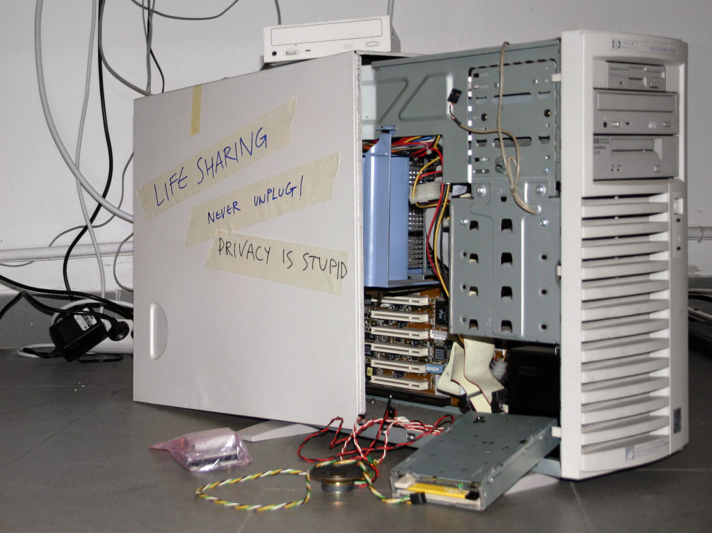
Life Sharing is an art project by the net art duo 0100101110101101.org consisting of Eva and Franco Mattes. During the period of three years (2000-2003) they shared all their home computer content in real time to the public: emails, bank statements and all other files that can be found on someones computer. Everything could be read, copied and downloaded.
The project happened before social media was so widespread on the internet making it an interesting case study on how we receive public and private personal information that is shared online. The project attracted many curious visitors, hackers and concerned people saying that sharing your personal desktop can be dangerous when the wrong people get a taste of it.
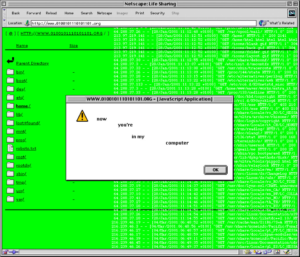
Life Sharing was meant to exist forever but due to problems of maintaining the computer and keeping all the data online at all time the duo decided to finish the project after three years. Nowadays the project can be accessed as archive:
lifesharing.rhizome.org, it is an artifact that gives a good impression of the zeitgeist of the pre -social and smartphone era.
Eva and Franco Mattes also shared their location 24/7 using GPS data. At the time this was provoking and controversial but right now we share our location constantly when we check in at a restaurant or post a picture of the sunset on Instagram.
The project pushes the boundaries of how we perceive sharing and open-source concepts comparable to social media companies that also push our notion of what we will and will not share to the world wide web. This raises the question: to whom are we sharing and what do we get back when we share online? Sharing ≠ Caring
The Cloud begins with coal
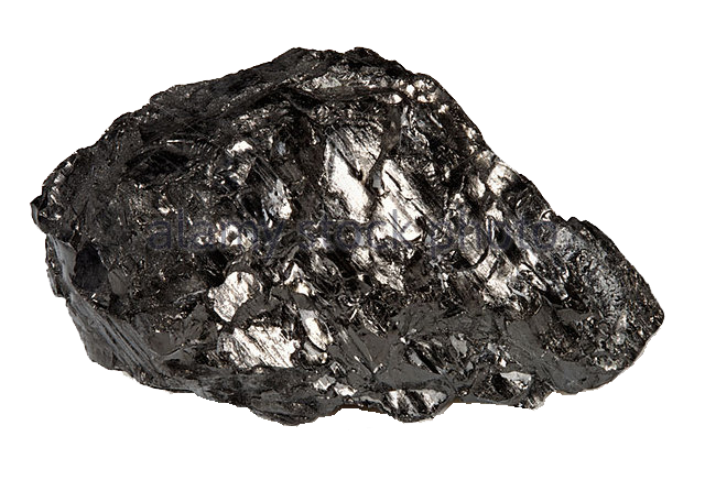
When we dive further into the affects of cloud computing on the environment we discover that the cloud is not so green as many ICT companies claim. The annual amount of energy costs for the cloud (and the production of it) equals all the electricity that is generated in Japan and Germany combined. The production and use of datacenters, computers, smartphones and tablets increases every year, the demand for higher quality streaming also increases. So the outcome is an exponential growth in the amount of electricity we consume.
Coal is still the largest source of electricity and fuels our need for data. But we all know that unlike the ever growing bits of data the resources of coal are not growing at all.
Mark P. Mills, CEO of the Digital Power Group wrote a paper on this subject: The Cloud begins with coal.
Wouter Stroet (1995) is a (graphic) designer. This Anything Makes Sense gives a glimpse into his graduation project: ‘We Are (N)ever Lost’.